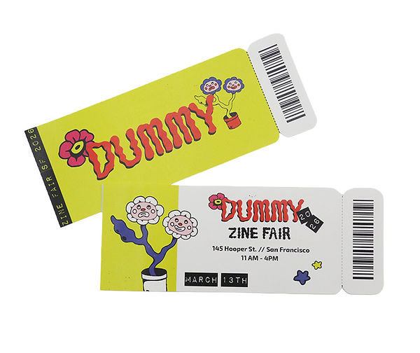
Dummy Zine Fair
Brand Identity: Fall 2025
“Dummy” is an Identity designed for a fictional zine fair in San Francisco, that emphazies publication trading, local print shops, and brings community together to share and create.
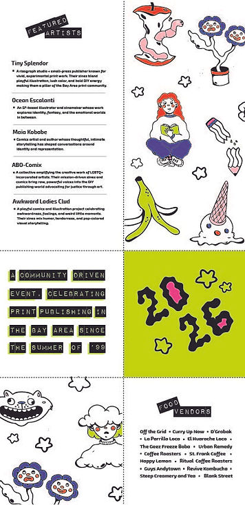
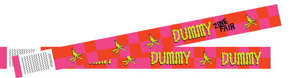
The identity is fun and colorful featuring hand drawn illustrations . While Dummy itself is named after the paper dummies made in the initial test of print publication most of the illustrations play to the other meaning of the word. They reference symbols of foolishness, such as the banana peel, long used in visual comedy as a device for comedic falls. Handdrawing was a big part of the visual language both in the illustration and well as in the type. The main type used for the Dummy logo was hand drawn as well wanting to give homage to the history of handmaking in zine creation.
Other points of visual reference came from common folding methods for zines. Colors are blocked out in patterns of zine folds and between the areas of separation dotted lines are placed mimicking visuals to show where to fold. Together the elements became a cohesive identity refined for use across an array of products for the event.